


Visual Basic extensions (VBXes) and OLE custom controls (OCXes) are extra or third-party components that can be added to your Visual Basic project. Custom controls provide additional functionality and capabilities to your application. The functionality
and capabilities are built into the components. The custom controls can range from text boxes that provide additional capabilities, such as automatic text selection, to complete spreadsheets or word processing applications.
By using custom controls, you are able to greatly reduce the effort that is needed in order to add additional functions and features to your application.
VBX custom controls have been available since Version 1.0 of Visual Basic. VBX custom controls currently are supported in other development environments (Microsoft C++ and Delphi, for example). With the release of version 4.0 of Visual Basic, the OCX
type of custom control was introduced. The OCX control is based on the OLE version 2 application model. Currently, this type of control is supported by Visual Basic 4.0 and Access 2.0. Other development platforms will be able to host OCX controls (Visual
Fox Pro and Microsoft C++ 4.0, for example). OCX controls exist in both 16-bit and 32-bit models, whereas VBX controls exist only in 16-bit models.
The 16-bit version of Visual Basic supports both 16-bit OCX controls and 16-bit VBX controls. The 32-bit version of Visual Basic supports only 32-bit OCX controls.
If your application is using custom controls, you must be aware of the following points and potential problems when using OCX/VBX controls. As there are many applications created with Visual Basic, there is a good chance you could find yourself in a
situation similar to that described here:
- If a different version of the custom control (perhaps an older version) is installed on your system, your application may behave differently. A sure way around this problem is to check for the version number of the VBX or OCX control that your
application is expecting. You can check this as part of your start-up routine. If your application finds that a version of controls is installed that it does not support or recognize, it can warn the user. The application then can provide a choice: to exit
or to continue.
- VBX and OCX controls generally are not distributed with their source code to developers. If you find a problem with the control, you must find a way to work around the problem or convince the vendor to fix it.
- The VBX or OCX file is another file that must be controlled and shipped with your application.
In the next section, you learn how to retrieve the Windows version information based on the name of the file passed to it.
In order to add a custom control to your application, you will need to use the Custom Controls dialog (see Figure 21.1). The contents of the Custom Controls dialog is determined based on the state of the control's insertable objects, selected items
only, and check boxes. If you select controls, then all of the OCX and VBX controls that have been registered with the OLE registry will be displayed. If you select Insertable objects, all of the OLE objects that have been registered with the OLE registry
will be displayed (an example of an insertable object is an Excel spreadsheet). If the control is part of the current project, an X appears at the left of the control. If a control is installed on your system, but it is not listed in the Available Controls
list, you can add it to the list by clicking the Browse button. Selected items will display only the custom controls and insertable objects that are part of the current project. You are unable to remove a control from the selected item that is currently
being used in your project.
Figure 21.1. Illustrates the Custom Control Selection dialog.
In order to add a VBX or OCX control to your project, you need to complete the following steps:
- Choose Tools | Custom Controls.
- Select the control that you wish to add by clicking on the box to the left of the control (for example, the Common Dialog control).
- Once the control has been selected, a graphic representation of the control will be visible in your toolbox (see Figure 21.2).
- Once the control is part of your toolbox, it can be used in the same manner as any other Visual Basic control.
Figure 21.2. The toolbox with the newly added common Dialog control.
The Standard Edition of Visual Basic contains five custom controls; the Professional Edition of Visual Basic contains 19 custom controls. These controls were obtained from various VBX and OCX vendors who may sell another version of the control with
additional functionality. Some of the commercial counterparts to the custom controls covered in this chapter are covered in Chapter 30, "Using Third Party VBX/OCX Controls." Table 21.1 lists the controls included in each version.
Table 21.1. Controls included in Standard Edition versus Professional Edition.
Custom Control
|
Standard Edition
|
Professional Edition
|
|
3D Controls
|
|
X
|
|
Animated Button
|
|
X
|
|
Data Bound ComboBox
|
X
|
X
|
|
Data Bound Grid
|
X
|
X
|
|
Data Bound ListBox
|
X
|
X
|
|
Common Dialog
|
X
|
X
|
|
Communications
|
|
X
|
|
Crystal Reports
|
|
X
|
|
Gauge
|
|
X
|
|
Graph
|
|
X
|
|
Grid
|
X
|
X
|
|
Key State
|
|
X
|
|
MaskEdit TextBox
|
|
X
|
|
Microsoft Mail
|
|
X
|
|
MultiMedia
|
|
X
|
|
Outline
|
|
X
|
|
Picture Clipping
|
|
X
|
|
Spin
|
|
X
|
|
Tabbed Dialog
|
|
X |
The 32-bit version of Visual Basic also includes controls that can be used only in Windows 95 and Windows NT 3.51 and later. These additional controls are shown in Table 21.2.
Table 21.2. Controls included for Windows 95, Windows NT 3.51 only.
Control
|
Function
|
|
ImageList
|
Enables you to store bitmap images that then can be used by the other controls listed in this table
|
|
ListView
|
Provides the Standard view so that you can display the contents of folders
|
|
ProgressBar
|
Adds the new Windows 95 type progress indicator; provides a function similar to the Gauge custom control
|
|
RichText
|
Displays documents in Rich Text format
|
|
Slider
|
Indicates a sliding scale
|
|
StatusBar
|
Adds the new Windows 95 status bar; provides a function similar to the KeyStats custom control
|
|
TabStrip
|
The Tab Strip control can be used as an alternative to tabbed dialog control supplier with the Professional Edition of Visual Basic. Additionally, the TabStrip control can be used in order to provide a group of push buttons where only one button may be
depressed at any one time.
|
|
Toolbar
|
Adds the functionality of a toolbar to your application |
If the project you have developed includes custom controls, the files relating to these custom controls must be included when you distribute your application. The easiest method to ensure that the correct files are distributed is to use the SetupWizard
application that is included with Visual Basic. Once you have completed your application, you need to perform the following steps in order to create distribution diskettes.
- Start the SetupWizard Application by double-clicking on the SetupWizard icon contained in the Visual Basic Program Group. You will see a dialog like the one illustrated in Figure 21.3.
Once the SetupWizard has started, you need to supply the path to your applications project file. You can also indicate if you want your project recompiled prior to the creation of your distribution media. The SetupWizard will then read through all of
the files in your project in order to determine if there are any external files that need to be included. If you have selected the compile option, the SetupWizard will also recompile your application. Once you have entered your project file name, press the
Next button in order to continue to the next step.
Figure 21.3. SetupWizard startup.
- Once the SetupWizard has completed step one, you will then be prompted with a list of external Data Access Engines (DBASE III, for example) that may be needed by your application (see Figure 21.4). If your application does not perform any data access
or uses the Jet engine exclusively, you may skip this step; otherwise, select the appropriate items from the list. Once you have completed this step, press the Next button in order to continue to the next step.
Figure 21.4. SetupWizard Data Access Engine selection.
 Note
Note
You can go back a step by pressing the Back button.
- Once the SetupWizard has completed step two, you will then be prompted for the destination drive and directory for the distribution files (see Figure 21.5). You are able to place your distribution files either directly on diskette or save them to your
PC's hard disk and copy them at a later date. Once you have selected the destination drive and directory, press the Next button in order to continue to the next step.
Figure 21.5. SetupWizard Destination selection.
- Once the SetupWizard has completed step three, you will then be prompted to add any needed OLE servers to the distribution files (see Figure 21.6). If your application is using OLE Servers, enter the details via the Add OLE Servers dialog. Once this is
complete, press the Next button in order to continue to the next step.
- Once the SetupWizard has completed step four, you will be prompted with a list of files that the SetupWizard has determined that need to be distributed with your application (see Figure 21.7). If there are files included in the list that you do not
wish to distribute (for example, you know they are resident on the user's Machine), clear the check box next to the file. Once you are satisfied with the files included for distribution, press the Next button in order to continue to the next step.
Figure 21.6. SetupWizard OLE Server setup.
Figure 21.7. SetupWizard OLE Server setup.
- Once the SetupWizard has completed step five, you will be prompted for the type of application that you are distributing (see Figure 21.8). If you are distributing an OLE shared component, the component will be installed in the shared OLE components
directory; otherwise, the application will be installed into a directory of the user's choice.
- Once the SetupWizard has completed step six, you will be prompted with a final list of files that the SetupWizard has determined should be distributed with your application (see Figure 21.9). You are able to deselect files in the same manner as
described in step five. Additionally, you can specify additional files that you may wish to distribute with your application (an example of an additional file would be a database). If you wish to add additional files, select the Add button and enter the
path to the files that you wish to add. Once you have finalized the contents of your application, you should save a template that can then be used in future distribution builds by the SetupWizard.
Once you have completed this step, press the Finish button, and the SetupWizard will compress all of the distribution files and copy them to the destination that was indicated in step three. The SetupWizard will also create a setup program that can be
used to install the application.
Figure 21.8. SetupWizard OLE Server setup.
Figure 21.9. SetupWizard Files Addition, removal.
The following sections discuss the main purposes of the controls and provide examples to illustrate the behaviors of these controls.
Note
The Crystal Reports Custom Control is covered in Chapter 8, "Reporting Mechanisms."
Six controls are included with the 3D controls:
- 3D Check Box
- 3D Frame
- 3D Command Button
- 3D Panel
- 3D Option Button
- 3D Ribbon Button
The 3D controls are similar to existing Visual Basic controls (the check box, for example). However, the 3D controls contain additional properties. Some of the enhancements over the standard Visual Basic controls follow:
- The Command button can display a picture.
- All the controls can display 3D fonts.
- The 3D panel can display text or can be used as a progress meter.
- The 3D Ribbon control can be used as command buttons, or it can be used to create pushbuttons. You can use this control to create a group of pushbuttons and allow only one of the buttons to be pressed at any one time.
- The 3D panel can have a raised or inset border.
- The border size of a 3D panel can be changed.
- The frame on the 3D Frame control can be raised or lowered.
- The 3D controls will always appear in 3D regardless of the forms Appearance property.
- The 3D controls default to a gray background.
To check out some of the capabilities of some of the 3D controls, follow these steps:
- Using the File | New Project command, open a new project.
- Follow the steps outlined in the "Adding Custom Controls to Your Project" section in order to add the Sheridan 3D controls to your project.
- Double-click on the Picture control (PictureBox in ToolTips display) contained in the toolbox in order to place a Picture control on your form.
- Include the following property settings for the Picture control:
Align = Align Top
Appearance = 1-Flat
BackColor = Grey
Left = 0
Height = 465
Width = 6690
- Single-click the 3D Ribbon control contained in the toolbox (SSRibbon in ToolTips display). Draw three 3D Ribbon controls on to the picture control.
- Include the following property settings for the 3D Ribbon button control:
SSRibbon1
Autosize = 2 - Autosize button to Picture
Name = ribBold
GroupNumber = 1
Left = 4260
PictureDisabled= c:\vb40\bitmaps\toolbar3\bld-dis.bmp
PictureDn= c:\vb40\bitmaps\toolbar3\bld-mds.bmp
Pictureup= c:\vb40\bitmaps\toolbar3\bld-up.bmp
SSRibbon2
Autosize = 2 - Autosize button to Picture
Name = ribCenter
GroupNumber = 2
Left = 4800
PictureDisabled= c:\vb40\bitmaps\toolbar3\cnt-dis.bmp
PictureDn= c:\vb40\bitmaps\toolbar3\cnt-mds.bmp
Pictureup= c:\vb40\bitmaps\toolbar3\cnt-up.bmp
SSRibbon3
Autosize = 2 - Autosize button to Picture
Name = ribItalic
GroupNumber = 3
Left = 5280
PictureDisabled= c:\vb40\bitmaps\toolbar3\itl-dis.bmp
PictureDn= c:\vb40\bitmaps\toolbar3\itl-mds.bmp
Pictureup= c:\vb40\bitmaps\toolbar3\itl-up.bmp
- Single-click the 3D Command Button control contained in the toolbox (SSCommand in ToolTips display). Draw one 3D Command Button control on the Picture control.
- Include the following property settings for the 3D Command button control:
Autosize = 2 - Autosize button to Picture
Name = cmdHelp
Left = 5880
Picture= c:\vb40\bitmaps\toolbar3\hlp-up.bmp
- Add the following code to the cmdHelp_Click event.
MsgBox " Help Button Was Pressed "
- Double-click on the 3D Panel control (SSPanel in ToolTips display) contained in the toolbox in order to place a 3D Panel on to your form.
- Include the following property settings for the 3D Panel control:
BevelInner = 1- Insert Bevel
BevelOuter = 2- Raised Bevel
BevelWidth = 1
BorderWidth =1
Caption =
FloodShowPCt = True
FloodType = 1 - From Left to Right
Height = 315
Left = 1800
Name = pnlGauge
Top = 5520
Width = 6690
- Double-click on the 3D Command Button control (SSCommand in ToolTips display) contained in the toolbox in order to place a 3D Command Button on your form.
- Include the following property settings for the 3D Command button control:
Caption = &Gauge
Height = 495
Left = 1920
Name = cmdGauge
Top = 3300
Width = 1215
- Add the following code to the cmdGauge_Click event:
Dim x As Integer
Dim y As Integer
Screen.MousePointer = 11
' Gauge in Panel
For x = 1 To 100
pnlgauge.FloodPercent = x
If x = 49 Then
pnlgauge.ForeColor = &HFFFFFF
End If
For y = 1 To 1000
DoEvents
Next y
Next x
Screen.MousePointer = 0
- Press the F5 key to run the project.
Once the project is running, you can click the Gauge button; the pnlGauge control displays a progress bar (see Figure 21.10). Clicking the Help command button displays a message box indicating that the button has been pressed. You can also see the
behavior of non-grouped Ribbon buttons.
Figure 21.10. Illustrates the use of the 3D Panel Control as a progress meter.
You use the Animated Button control to show a series of pictures to emulate animation. If you want to determine the bitmap that is displayed or to change the currently displayed bitmap, you should retrieve or change the Value property. You can use this
control to convey a series of images to the user, much like a cartoon.
In the example in this section, you use the Animated Button control to step through the four suites available in a deck of cards. All the pictures used in this example are located in the Assorted bitmaps directory.
To use the Animated Button control, follow these steps:
- Using the File | New Project command, open a new project.
- Follow the steps outlined in the "Adding Custom Controls to Your Project" section to add the Desaware Animated Button control to your project.
- Double-click on the Animated Button control (AniPushButton in ToolTips display) contained in the toolbox in order to place an Animated Button on your form.
- Press the F4 key in order to access the property setting of the newly added Animate button. Select the Custom property. You will then be presented with a Tabbed dialog displaying the Custom properties that can be changed. Enter the following property
settings:
General Tab 1
Cycle - 1- By Frame
BorderStyle - None
PictdrawMode - Autosize
General Tab 2
Caption - Empty String
Speed - 32767
Value - 1
Frame Setting Tab
Select Frame 1
Load file c:\vb40\bitmaps\assorted\club.bmp
Select Frame 2
Load file c:\vb40\bitmaps\assorted\diamond.bmp
Select Frame 3
Load file c:\vb40\bitmaps\assorted\heart.bmp
Select frame 4
Load file c:\vb40\bitmaps\assorted\spade.bmp
NOTE
The Bitmaps\Assorted directory is located inside the directory in which Visual Basic was installed.
- After all of the above property settings have been completed, press the OK button.
- Enter the following code in the AniPushButton1_Click event:
AniPushButton1.Value = 1
For x = 1 To 10000
DoEvents
Next
AniPushButton1.Value = 2
For x = 1 To 10000
DoEvents
Next
AniPushButton1.Value = 3
For x = 1 To 10000
DoEvents
Next
AniPushButton1.Value = 4
- Press the F5 key to run the project.
- Click the AniButton control so that your application will cycle through the four bitmaps.
Because the displayed bitmaps are fairly small and do not take much time to load, DoEvents loops are needed. Otherwise, the pictures would change so quickly that you would be unable to see them. If the picture flips too slowly, decrease the counter
value for the loops; if the bitmaps change too quickly, you might want to increase the delay. In order to increase or decrease the delay, alter the value of the To parameter in the For statements contained in the AniPushButton1_Click event.
You can use the Data Bound ComboBox control to display the information stored in a database in a combo box without having to manually add the items, as you would if you were using an unbound combo box. You can update the contents of different fields
based on the selection made in the combo box.
Suppose that you have a master record containing a code-type field (PubID), and its definition is defined in another table (Publishers). When the description of the code field (Publishers) is selected from the ListBox, the equivalent code (PubID) is
updated in the master record.
The following example illustrates a combo box bound to the Publishers table. When a selection is made, the PubID field in the Titles table is updated. Follow these steps:
- Using the File | New Project command, open a new project.
- Follow the steps outlined in the "Adding Custom Controls to Your Project" section to add the Microsoft Data Bound List controls to your project.
- Double-click on the Data control (Data in ToolTips display) contained in the toolbox to place a Data control on your form.
- Include the following property settings for the Data control:
DatabaseName = C:\vb40\biblio.mdb
Recordsource = select * from titles
- Double-click on the Data Control (Data in ToolTips display) contained in the toolbox to place a Data control on your form.
- Include the following property settings for the Data Bound List control:
name = dtaList
DatabaseName = C:\vb40\biblio.mdb
Height = 1815
Left = 3780
Top = 1260
Width = 2895
Recordsource = select * from publishers
- Double-click on the Data Bound ComboBox control (DBCombo in ToolTips display) contained in the toolbox to place a Data Bound ComboBox control on your form.
- Include the following property settings for the Data Bound ComboBox control:
BoundColumn = PUBID
DataField = PUBID
DataControl = Data1
Height = 315
Left = 1560
ListField = name
Name = dbCompub
RowSource = dtaList
Top = 180
Width = 3135
- Double-click on the TextBox control (TextBox in ToolTips display) contained in the toolbox in order to place a TextBox control on to your form.
- Include the following property setting for the TextBox control:
Height = 315
Left = 1680
Name = txtPubid
Top = 1260
Width = 675
- Double-click on the Label control (Label in ToolTips Display) contained in the toolbox to place a Label control on your form.
- Include the following property setting for the Label control:
Caption = Publisher
Height = 195
Left = 120
Name = pnlTitle
Top = 240
Width = 1215
- Double-click on the Label control (Label in ToolTips display) contained in the toolbox to place a Label control on your form.
- Include the following property setting for the Label control:
Caption = Publisher ID
Height = 195
Left = 120
Name = pnlPubid
Top = 1320
Width = 1215
- Add the following code to the dbcompub_Click event:
txtPubid.Text = dbCompub.BoundText
- Press the F5 key in order to run the project.
The combo box contains the publisher's name. When the publisher's name is selected from the combo box, the PubID field is displayed in the text box (see Figure 21.11).
Figure 21.11. The Data Bound combo box.
You can use the Data Bound Grid to enable your application to display the recordset of a data control in row/column format. The contents of the recordset can be a complete table or the results of an SQL statement. You can perform the following functions
on data displayed in the grid:
- Edit
- Add
- Delete
- Cut
- Copy
- Paste
You can set the contents of each column of the grid by specifying the field the column will hold. The caption for the column defaults to the name of the database field. You can change this caption to something more descriptive at design time and
runtime. At runtime and design time, you can determine which features will be available to the users of your application, and you can limit the action that will be permitted on the recordset.
To understand the capabilities of the Data Bound Grid control, follow these steps:
- Use the File | New Project command to open a new project.
- Follow the steps outlined in the "Adding Custom Controls to Your Project" section to add the Apex Data Bound Grid control to your project.
- Double-click on the Data control (Data in ToolTips display) contained in the toolbox to place a Data control on your form.
- Double-click on the Data Bound Grid control (DBGrid in ToolTips display) contained in the toolbox to place a Data Bound Grid control on your form.
- Click and drag the top-left corner of the Data Bound Grid control to the top-left corner of the form. Click and drag the bottom-right corner of the Data Bound Grid so that the Data Bound Grid occupies most of your form.
- Include the following property settings in the Data control:
DatabaseName = C:\vb40\biblio.mdb
Recordsource = select * from titles order by title
- Include the following property setting for the Data Bound Grid control:
DataSource = Data1
- Press the F5 key to run the project.
When the project is running, you should see the contents of the Titles table from the BIBLIO database, in order by book title (see Figure 21.12). You can edit the records contained in the grid. Select a complete row for deletion. Add new records to the
table. Resize the columns and rows. Then scroll through the complete table.
Figure 21.12. Using the Data Bound Grid control.
You can use the Data Bound ListBox control to display the information stored in a database in a ListBox without having to manually add the items, as you would if you were using an unbound ListBox. You can update the contents of different fields based on
the selection made in the ListBox.
Suppose that you have a master record containing a code-type field (PubID), and its definition is provided in another table (Publishers). When the description of the code field (Publishers) is selected from the ListBox, the equivalent code (PubID) is
updated automatically in the master record.
The following example illustrates a ListBox that is bound to the Publishers table. When a selection is made, the Publisher's ID is updated to the Titles table. Follow these steps:
- Using the File | New Project command, open a new project.
- Follow the steps outlined in the "Adding Custom Controls to Your Project" section to add the Microsoft Data Bound List controls to your project.
- Double-click on the Data control (Data in ToolTips display) contained in the toolbox to place a Data control on your form.
- Include the following property settings for the Data control:
DatabaseName = C:\vb40\biblio.mdb
Recordsource = select * from titles order by title
- Double-click on the Data control (Data in ToolTips display) contained in the toolbox to place a Data control on your form.
- Include the following property settings for the Data control:
name = dtaList
DatabaseName = C:\vb40\biblio.mdb
Height=1875
Left=3780
Top=1260
Width=2895
Recordsource = select name,pubid,pubid & " " & name as test from publishers
- Double-click on the Data Bound ListBox (DBList in ToolTips display) contained in the toolbox to place a Data Bound ListBox control on your form.
- Include the following property settings for the Data Bound ListBox control:
BoundColumn = PUBID
DataField = PUBID
DataControl = Data1
Height=1815
Left=3780
Listfield = test
Name = dblistPub
RowSource = dtaList
Top=1260
Width=2895
- Double-click on the TextBox (Text in ToolTips display) contained in the toolbox to place a TextBox control on your form.
- Include the following property setting for the TextBox control:
Height = 315
Left = 1680
Name = txtPubid
Top = 1260
Width = 675
- Add the following code to the dbListpub_Click event:
txtPubid.Text = dblistPub.BoundText
- Double-click on the Label control (Label in ToolTips display) contained in the toolbox to place a Label control on your form.
- Include the following property setting for the Label control:
Caption = Publisher
Height = 195
Left = 120
Name = pnlTitle
Top = 240
Width = 1215
- Press the F5 key to run the project.
The contents of the ListBox will be a combination of the publisher's ID and the publisher's name. When an entry is selected, the PubID field in the Titles table is updated based on the PubID of the selection made. The publisher ID is also displayed in
the List Box.
You can use the Common Dialog control to enable your application to display dialog boxes consistent with those of other Windows applications. You use the Common Dialog control to prompt users to perform certain actions. The user interface elements
provided by this control follow:
Element
|
Function
|
|
Color
|
Prompts the user to select or define a color.
|
|
File Open
|
Prompts the user to select the location and the file to open.
|
|
File Save
|
Prompts the user to save a file, specifying the name and location of the file being saved.
|
|
Fonts
|
Prompts the user to select a font.
|
|
Printer
|
Prompts the user to select or change the active printer or to change the printer's characteristics. An example of this would be the tray to be used for printing or the paper to be used.
|
|
WinHelp
|
Enables the user to evoke the WinHelp program to open a specified Windows Help file at a certain location. |
NOTE
You cannot set the location in which a Common Dialog will be displayed on the screen.
To use the Common Dialog control, follow these steps:
- Using the File | New Project command, open a new project.
- Follow the steps outlined in the "Adding Custom Controls to Your Project" section to add the Microsoft Common Dialog control to your project.
- Double-click on the Command Button control (CommandButton in ToolTips Display) contained in the ToolBox and place five command buttons on your form.
- Using the property editor, set the following properties of the command buttons:
Command Button 1
Left = 120
Name = cmdColor
Top = 4260
Width = 1215
Command Button 2
Left = 2760
Name = cmdFonts
Top = 3660
Width = 1215
Command Button 3
Left = 5400
Name = cmdHelp
Top = 3660
Width = 1215
Command Button 4
Left = 120
Name = cmdOpen
Top = 3660
Width = 1215
Command Button 5
Left = 4080
Name = cmdPrint
Top = 3660
Width = 1215
Command Button 6
Left = 1440
Name = cmdSave
Top = 3660
Width = 1215
- Double-click on the Common Dialog control (Common Dialog in ToolTips display) contained in the toolbox to place a Label control on your form.
- In order to illustrate some of the functionality of the Color Common dialog, enter the following code in the cmdColor_Click event:
CommonDialog1.DialogTitle = " Select A Color "
CommonDialog1.Flags = &H2
CommonDialog1.ShowColor
MsgBox " The following Color has Been Selected " & CommonDialog1.Color
the flag property indicates that the user will be able to define custom colors.
- In order to illustrate some of the functionality of the Fonts Common dialog, enter the following code in the cmdFonts_Click event:
CommonDialog1.DialogTitle = " Select A Font "
CommonDialog1.Flags = &H40000
CommonDialog1.ShowFont
the flag property indicates that only TrueType fonts will be displayed
- In order to illustrate some of the functionality of the Help Common dialog, enter the following code in the cmdHelp_Click event:
CommonDialog1.DialogTitle = " Select A Help Topic "
CommonDialog1.HelpCommand = &H4
CommonDialog1.ShowHelp
the flag property indicates that the Help on Help Function will be run
- In order to illustrate some of the functionality of the File Open Common dialog, enter the following code in the cmdOpen_Click event:
CommonDialog1.DialogTitle = " Open A File "
CommonDialog1.Filter = "*.*"
CommonDialog1.FileName = "*.*"
CommonDialog1.ShowOpen
MsgBox " You have selected " & CommonDialog1.FileName & " As the file to Open"
- In order to illustrate some of the functionality of the Print Common dialog, enter the following code in the cmdPrint_Click event:
CommonDialog1.DialogTitle = " Select A Printer "
CommonDialog1.Flags = &H100&
CommonDialog1.ShowPrinter
the flag property indicates to return the printer HDC once it has been selected
MsgBox " The Selected printer has the Windows device handle of " & CommonDialog1.hDC
- In order to illustrate some of the functionality of the Save as Common dialog, enter the following code in the cmdSave_Click event:
CommonDialog1.DialogTitle = " Save A File "
CommonDialog1.Filter = "*.*"
CommonDialog1.FileName = "*.*"
CommonDialog1.Flags = &H2&
CommonDialog1.ShowSave
MsgBox " You have selected " & CommonDialog1.FileName & " As the file to Save to "the flag property indicates the user will be prompted if an existing file has been selected
- Press the F5 key to run the project.
When the project is running, you are able to see the behavior of all the available common dialog boxes. When you open or save a file, a message box appears indicating the name of the file selected (see Figure 21.13). When a color is selected from the
colors Common Dialog box, the Windows internal representation of the color will be displayed in a message box. The Help dialog box takes the user to Windows Help. When a Printer is selected from the printers Common Dialog box, the Windows device context ID
for that printer will be displayed in a message box. The Font dialog box tells the user which font is selected.
Figure 21.13. The Save As File dialog box.
You can use the Communications control to enable your application to communicate through the serial ports of the computer on which it is running. You must use one control for each serial port that you want to control. You are able to control the
following aspects of the device (modem) attached to the serial port of your computer where your application is running:
- Data Line Speed
- Communication Protocol
- Indicate to the modem that the computer is ready to accept input from the modem
- Indicate to the modem that the computer is ready to send information to the modem
- Retrieve the data that has been sent to the modem from another source
- Transfer data from the computer to the modem, thus allowing the modem to send data to another source
- Control all aspects of communication between two devices
The Communications control can be used to develop applications as simple as telephone dialer or as complicated as a complete communications package.
The following example illustrates the use of the Communications control to dial a telephone number. Follow these steps:
- Use the File | New Project command to open a new project.
- Follow the steps outlined in the "Adding Custom Controls to Your Project" section to add the Microsoft Comm control to your project.
- Double-click on the Communication control (MSComm in ToolTips display) contained in the toolbox to place a Label control on your form.
- Double-click on the Command Button (CommandButton in ToolTips display) contained in the toolbox to place a Command Button control on your form.
- Include the following property setting for the Command Button control:
Name = cmdHangUp
Caption = "&Hang Up"
Height = 395
Left = 4380
Top = 3480
Width = 1215
- Double-click on the Command Button (CommandButton in ToolTips display) contained in the toolbox to place a Command Button control onto your form.
- Include the following property setting for the Command Button control:
Name = cmdDial
Caption = "&Dial"
Height = 395
Left = 2940
Top = 3480
Width = 1215
- Double-click on the ComboBox control(ComboBox in ToolTips display) contained in the toolbox to place a ComboBox control on your form.
- Include the following property setting for the ComboBox control:
Name = comParity
Height = 315
Left = 3000
Style = 2 'Dropdown List
Top = 2880
Width = 1755
- Double-click on the ComboBox control(ComboBox in ToolTips display) contained in the toolbox to place a ComboBox control on your form.
- Include the following property setting for the ComboBox control:
Name = comStopBits
Height = 315
Left = 3000
Style = 2 'Dropdown List
Top = 2400
Width = 1755
- Double-click on the ComboBox control(ComboBox in ToolTips display) contained in the toolbox to place a ComboBox control on your form.
- Include the following property setting for the ComboBox control:
Name = comDataBits
Height = 315
Left = 3000
Style = 2 'Dropdown List
Top = 1920
Width = 1755
- Double-click on the ComboBox control (ComboBox in ToolTips display) contained in the toolbox to place a ComboBox control on your form.
- Include the following property setting for the ComboBox control:
Name = comLineSpeed
Height = 315
Left = 3000
Style = 2 'Dropdown List
Top = 1440
Width = 1755
- Double-click on the ComboBox control (ComboBox in ToolTips display) contained in the toolbox to place a ComboBox control on your form.
- Include the following property setting for the ComboBox control:
Name = comCommPort
Height = 315
Left = 3000
Style = 2 'Dropdown List
Top = 960
Width = 1755
- Double-click on the Label control (Label in ToolTips display) contained in the toolbox to place a Label Control on your form.
- Include the following property setting for the Label control:
Name = txtNumber
Height = 300
Left = 3000
Top = 480
Width = 2355
- Double-click on the Label control (Label in ToolTips display) contained in the toolbox to place a Label Control on your form.
- Include the following property setting for the Label control:
Name = lblParity
Caption = "Parity"
Height = 300
Left = 420
Top = 2880
Width = 2175
- Double-click on the Label control (Label in ToolTips display) contained in the toolbox to place a Label Control on your form.
- Include the following property setting for the Label control:
Name = lblStopBits
Caption = "Stop Bits"
Height = 300
Left = 420
Top = 2400
Width = 2175
- Double-click on the Label control (Label in ToolTips display) contained in the toolbox to place a Label Control on your form.
- Include the following property setting for the Label control:
Name = lblDataBits
Caption = "Data Bits"
Height = 300
Left = 420
Top = 1920
Width = 2175
- Double-click on the Label control (Label in ToolTips Display) contained in the toolbox to place a Label Control on your form.
- Include the following property setting for the Label control:
Name = lbl_linespeed
Caption = "Line Speed"
Height = 300
Left = 420
Top = 1440
Width = 2175
- Double-click on the Label control (Label in ToolTips display) contained in the toolbox to place a Label Control on your form.
- Include the following property setting for the Label control:
Name = lblCommPort
Caption = "Communication Port"
Height = 300
Left = 420
Top = 960
= 2175
- Double-click on the Label control (Label in ToolTips display) contained in the toolbox to place a Label Control on your form.
- Include the following property setting for the Label control:
Name = lblNumber
Caption = "Number To Dial"
Height = 295
Left = 420
Top = 480
Width = 2175
- Add the following code to the Form_Load event:
comCommPort.AddItem "Com1:"
comCommPort.AddItem "Com2:"
comCommPort.AddItem "Com3:"
comCommPort.AddItem "Com4:"
comDataBits.AddItem "8"
comDataBits.AddItem "7"
comLineSpeed.AddItem "19200"
comLineSpeed.AddItem "14400"
comLineSpeed.AddItem "9600"
comLineSpeed.AddItem "4800"
comLineSpeed.AddItem "2400"
comLineSpeed.AddItem "1200"
comParity.AddItem "N- None"
comParity.AddItem "O - Odd"
comParity.AddItem "E - Even"
comParity.AddItem "E - Mark"
comParity.AddItem "S - Space"
comStopBits.AddItem "1"
comStopBits.AddItem "1.5"
comStopBits.AddItem "2"
- Add the following code to the comCommPort_Click event:
Select Case comCommPort.TEXT
Case "Com1:"
MSComm1.CommPort = 1
Case "Com2:"
MSComm1.CommPort = 2
Case "Com3:"
MSComm1.CommPort = 3
Case "Com4:"
MSComm1.CommPort = 4
End Select
- Add the following code to the cmdDial_Click event:
If Len(comCommPort.TEXT) = 0 Then
MsgBox " You must Select a Communications Port prior to Dialing"
Exit Sub
End If
If Len(txtNumber.TEXT) = 0 Then
MsgBox " You Have Not Entered a Number Dial "
Exit Sub
End If
MSComm1.Settings = comLineSpeed.TEXT & "," & Mid$(comParity.TEXT, 1, 1) & "," & comDataBits.TEXT & "," & comStopBits.TEXT
MSComm1.PortOpen = True
MSComm1.Output = "ATDT" & "9," & txtNumber.TEXT & Chr$(13) ' Dial the requested number
- Add the following code to the cmdHangUp_Click event:
MSComm1.Output = "ATH0" + Chr$(13)
MSComm1.PortOpen = False
- Press the F5 key to run the project.
Once the project is running, you can select the Com: port that the modem is attached to. Additionally, you can set the communication protocol that the modem will employ (this will have no effect on the example; it is only included for illustration). If
you enter the telephone number that you want to dial in to the TextBox and press the Enter key, the number will be dialed for you. In order to disconnect the modem, press the Hang Up button.
You use the Gauge control to indicate the progression or status of a process. The gauge can be a horizontal or vertical bar that fills as the process takes place, or it can be a needle-type indication, much like that of a speedometer. You control the
position of the gauge's progress by the Value property. If the Value property exceeds the Gauge control's Maximum property, the value is reset to the value of the Maximum property. If the Value property is less than the Minimum property value, the Value
property is reset to the value of the Minimum property.
To learn how to use the Gauge control, go through the steps in the following procedure to create a gauge to indicate progress via a clock-like indicator. The picture used in this example is located in the Gauge directory. Follow these steps:
- Using the File | New Project command, open a new project.
- Follow the steps outlined in the "Adding Custom Controls to Your Project" section to add the Microhelp Gauge control to your project.
- Double-click on the Gauge control (Gauge in ToolTips display) contained in the toolbox to place a Gauge on your form.
- Press the F4 key to access the property setting of the newly added Gauge. Select the Custom Property. You will be presented with a Tabbed dialog displaying the custom properties that can be changed. Enter the following property settings:
General Tab 1
InnerTop = 20
InnerBottom = 20
InnerLeft = 20
InnerRight = 20
Max = 100
Min = 0
NeedleWidth = 2
Style = 3 Full Needle
Pictures Tab
Select the Picture Property and select the circclock.bmp.
- Using your mouse, click and drag the lower-right edge of the Gauge control so that you are able to fully view the clock bitmap.
- Double-click on the Command Button control (CommandButton in ToolTips display) contained in the toolbox to place a Command Button control on your form.
- Enter the following code in the command1_Click event:
Dim x As Integer
Dim y As Integer
Screen.MousePointer = 0
For x = 1 To 100
Gauge1.Value = x
For y = 1 To 1000
DoEvents
Next y
Next x
Screen.MousePointer = 0
- Press the F5 key to run the project.
Click the Command button. The needle on the graph moves around the clock (see Figure 21.14), indicating the progress of your operation. You might want to add a text panel to indicate the percentage of completion.
Figure 21.14. The Gauge control.
You can use the Graph control to quickly present numerical information graphically. The Graph control provides the following types of pre-built graphs:
- 2D pie
- 3D pie
- 2D bar
- 3D bar
- Gantt
- Line
- Log/line
- Area
- Scatter
- Polar
- High-low comparison
When designing your application, you can preview the types of graphs by setting the RandomData property to On. After you create a graph in your application, you can print it or copy it to the Clipboard for use in another application. Because the Graph
control uses a graphical drawing engine in addition to the VBX or OCX control, all changes to the data used by the graph are reflected in the graph almost immediately.
The following example will illustrate the different types of graphs that can be created using the Graph control. The Data used for the graph is provided using the QuickData property of the Graph control. To create the sample application using the Graph
control, follow these steps:
- Using the File | New Project command, open a new project.
- Follow the steps outlined in the "Adding Custom Controls to Your Project" section to add the Pinnacle-BPS Graph control to your project.
- Double-click on the Graph control (Graph in ToolTips Display) contained in the toolbox to place a Graph control on your form.
- Include the following property setting for the Graph control:
Name = Graph1
Height = 4215
Left = 60
Top = 0
Width = 6615
BorderStyle = 1
RandomData = 0
ColorData = 0
- Double-click on the Label control (Label in ToolTips display) contained in the toolbox to place a Label control on your form.
- Include the following property setting for the Label control:
Name = lblGraph
Caption = "Graph Type"
Height = 375
Left = 240
Top = 4680
Width = 1215
- Double-click on the ComboBox control (ComboBox in ToolTips display) contained in the toolbox to place a ComboBox control on your form.
- Include the following property setting for the ComboBox control:
Name= comGraph
Height = 315
Left = 2100
Style = 2 'Dropdown List
Top = 4680
Width = 4275
- Enter the following code in the Form_Load event:
Dim sTAB As String
Dim sCRLF As String
Dim sTestData As String
sTAB = Chr$(9)
sCRLF = Chr$(13) + Chr$(10)
sTestData = "11" & sTAB & "12" & sTAB & "13" & sCRLF & "5" & sTAB & "6" & sTAB_ & "7" + sCRLF & "20" & sTAB & "21" &
sTAB & "22" & sCRLF
Graph1.QuickData = sTestData
Graph1.LegendText = " HardWare"
Graph1.LegendText = " SoftWare"
Graph1.LegendText = " Services "
Graph1.LabelText = "USA"
Graph1.LabelText = "Europe"
Graph1.LabelText = "Asia"
comGraph.AddItem "1 - 2D Pie"
comGraph.AddItem "2 - 3D Pie"
comGraph.AddItem "3 - 2D Bar"
comGraph.AddItem "4 - 3D Bar"
comGraph.AddItem "5 - Gantt"
comGraph.AddItem "6 - Line"
comGraph.AddItem "7 - Log/Lin"
comGraph.AddItem "8 - Area"
comGraph.AddItem "9 - Scatter"
comGraph.AddItem "10 - Polar"
comGraph.AddItem "11 - HlC"
comGraph.ListIndex = 3
- Enter the following code in the comGraph_Click event:
Graph1.GraphType = CInt(Mid$(comGraph.TEXT, 1, 2))
Graph1.DrawMode = 2 ' Force the Graph to Re-Draw
- Depress the F5 key to run the project.
When the project is running, you will see the data presented as a 3D Bar Graph, as shown in Figure 21.15. You can change the type of graph by selecting a different format from the ComboBox.
Figure 21.15. Using the Graph control.
You can use the Grid control to display data in a row-and-column format. Unlike the Data Bound Grid control, the Grid control requires that you add data to control using the AddItem method. All editing of the data contained in the grid must be handled
by the application. You can place both text and pictures in the cells of the grid. Once the application is running, the user can scroll through the data, resize rows and columns, and select multiple rows of data on which actions supported by your
application can be performed.
The following example shows you how to load a grid from the data stored in the Titles table of the BIBLIO database. To use the Grid control, follow these steps:
- Using the File | New Project command, open a new project.
- Follow the steps outlined in the "Adding Custom Controls to Your Project" section to add the Microsoft Grid Gauge control to your project.
- Double-click on the Grid control (Grid in ToolTips Display) contained in the toolbox to place a Command Button control on your form.
- Click and drag the top-left corner of the Grid control to the top-left corner of the form. Click and drag the bottom-right corner of the Grid so that the Grid occupies most of your form.
- Include the following property setting for the Grid control:
Cols= 3
- Enter the following code in the Form_Load event:
Dim ws As WorkSpace
Dim db As Database
Dim rs As Recordset
Screen.MousePointer = 11
Set ws = DBEngine.CreateWorkspace("ws1", "ADMIN", "")
Set db = ws.OpenDatabase("C:\vb40\biblio.mdb", False, False)
Set rs = db.OpenRecordset("select * from Titles order by title", dbOpenDynaset)
rs.MoveLast
Grid1.Rows = rs.RecordCount + 2
rs.MoveFirst
Grid1.Row = 0
Grid1.Col = 0
Grid1.Text = "PUBID"
Grid1.ColWidth(0) = 1000
Grid1.Col = 1
Grid1.Text = "Year"
Grid1.ColWidth(1) = 1000
Grid1.Col = 2
Grid1.Text = "Title"
Grid1.ColWidth(2) = 3000
Grid1.Row = 1
Do While rs.EOF = False
Grid1.Col = 0
If Not IsNull(rs("pubid")) Then
Grid1.Text = rs("pubid")
End If
Grid1.Col = 1
If Not IsNull(rs("year published")) Then
Grid1.Text CStr(rs("year published"))
End If
Grid1.Col = 2
If Not IsNull(rs("title")) Then
Grid1.Text = rs("title")
End If
rs.MoveNext
Grid1.Row = Grid1.Row + 1
Loop
Screen.MousePointer = 0
- Press the F5 key to run the project.
When the project is running, you can see some of the data contained in the Titles table of the BIBLIO database, as shown in Figure 21.16. You can resize the rows and columns of the grid.
Figure 21.16. Using the Grid control.
The Key Status control enables you to monitor the status of these keys: Caps Lock, Scroll Lock, Num Lock, and Insert. The status of these keys generally is displayed in an application to give the user a quick reference to each key's status. Generally,
the status is displayed at the bottom of an MDI form.
To see how the Key Status control works, create a status bar that displays the status of certain keys at the bottom of an MDI form. Follow these steps:
- Using the File | New Project command, open a new project.
- Follow the steps outlined in the "Adding Custom Controls to Your Project" section to add the Microhelp Key State control to your project.
- Follow the steps outlined in the "Adding Custom Controls to Your Project" section to add the Sheridan 3D controls to your project.
- Using the Insert | MDI Form command, add an MDI form to your project.
- Double-click on the Picture control (Picture in ToolTips Display) contained in the toolbox to place a Picture control on your form.
- Select the Align property of the Picture control and set it to align Bottom.
- Double-click on the Key Status control (MhState in ToolTips display) contained in the toolbox to place four Key Status controls on your form.
- Include the following property settings for the Key Status controls:
Key Status 1
Name - Keyins
Style - 2- Insert Key
Key Status 2
Name - Keycaps
Style - 0- Caps Lock
Key Status 3
Name - Keynum
Style - 1- Num Lock
Key Status 4
Name - KeyScroll
Style - 3 - Scroll Lock
- Select the 3D panel control (SSPanel in ToolTips display) from the toolbox and draw four panels on the Picture control.
- Include the following property settings for the 3D Panel controls:
3D Panel 1
Name - pnlins
BevelInner - 0-No Bevel
BevelOuter - 1-Inset Bevel
BevelWidth - 2
BorderWidth - 2
Top - 60
Left - 6060
Height - 315
Width - 555
3D Panel 2
Name - pnlcaps
BevelInner - 0-No Bevel
BevelOuter - 1-Inset Bevel
BevelWidth - 2
BorderWidth - 2
Top - 60
Left - 3960
Height - 315
Width - 555
3D Panel 3
Name - pnlnum
BevelInner - 0-No Bevel
BevelOuter - 1-Inset Bevel
BevelWidth - 2
BorderWidth - 2
Top - 60
Left - 4620
Height - 315
Width - 555
3D Panel 4
Name - pnlscrl
BevelInner - 0-No Bevel
BevelOuter - 1-Inset Bevel
BevelWidth - 2
BorderWidth - 2
Top - 60
Left - 5340
Height - 315
Width - 555
- Select the Timer control from the toolbox (Timer in ToolTips display) from the toolbox and draw a timer on the Picture control.
- Include the following property setting for the Timer control:
Interval = 1000
- Enter the following code in the Timer1_Timer event:
' Caps Lock Key
If keycaps.Value = True Then
pnlcaps.Caption = "Cap"
Else
pnlcaps.Caption = ""
End If
' Num Lock Key
If keynum.Value = True Then
pnlnum.Caption = "Num"
Else
pnlnum.Caption = ""
End If
' Scroll Lock
If keyscrl.Value = True Then
pnlscrl.Caption = "Scrl"
Else
pnlscrl.Caption = ""
End If
' Insert Key
If keyinsert.Value = True Then
pnlins.Caption = "Ins"
Else
pnlins.Caption = "Ovr"
End If
- Press the F5 key in order to run the project.
While your project runs, the current status of the Caps Lock, Scroll Lock, Num Lock, and Insert keys is displayed at the bottom of the MDI form (see Figure 21.17). If these keys are enabled, you see Cap, Num, Scrl, and Ins in the status line. If the
keys are not enabled, the keys box in the status line appears blank. When the status of one of these keys changes, the display is updated accordingly.
Figure 21.17. Using the Key Status control.
The MaskEdit TextBox control provides the same basic functionality as that of the TextBox control included with Visual Basic. Properties have been added, however, to format the data displayed in the text box. The MaskEdit TextBox control also provides
additional properties to indicate the behavior of text stored in the control when it is copied from the text box.
To define a MaskEdit TextBox control in order to display date-related information, follow these steps:
- Using the File | New Project command, open a new project.
- Follow the steps outlined in the "Adding Custom Controls to Your Project" section to add the Microsoft MaskEdit TextBox control to your project.
- Double-click on the MaskEdit TextBox control (MaskEdBox in ToolTips display) contained in the toolbox to place a MaskEdit TextBox control on your form.
- Select the Custom Control property of the MaskEdit TextBox control and indicate the following property settings:
Name = txtDave
Format = MMMM-DD-YYYY
name= txtDate
Width 2200
- Add the following code to the Form_Load event:
txtDate.Text = Now
- Press the F5 key to run the project.
As illustrated in Figure 21.18, the MaskEdit TextBox control now contains the current date in the format MMMM-DD-YYYY. Once you have finished this example, save your project because we will be building on it in order to illustrate another custom
control.
Figure 21.18. Using the MaskEdit TextBox control.
You must use two controls to create a mail-enabled application: MAPIsession and MAPImessage.
NOTE
For a more in-depth look at a mail-enabled application, see Chapter 25, which concentrates on the Mail API.
NOTE
You must have access to Microsoft Mail and a Microsoft Mail server in order to use the MAPIsession and MAPImessage controls.
You use the MAPIsession control to establish a session between your application and the Microsoft Mail server. No events are associated with the MAPIsession control. All interaction between the control and the Mail server takes place through the methods
of the control. Two methods are applicable to the MAPIsession control: Signon (Establish a Session) and Signoff (End a Session). These two methods are used to manage the mail session.
Listing 21.1 illustrates establishing a session and signing off from the session using the MAPIsession control.
Listing 21.1. MAPIsession control.
MAPISession1.Username= "MAIL1"

MAPISession1.Password= "Password"

MAPISession1.LogonUI= False   'suppress the Logon Dialog

MAPISession1.Newsession= True   'Establish a new session

MAPISession1.downloadmail= true   'Download all mail when signed on

MAPISession1.signon  'sign on to the Mail server

'Perform Mail-related tasks

MAPISession1.signoff  sign off the Mail server
The MAPImessage custom control enables users to manipulate their messages (using Add, Edit, and Delete) and the Address Book. You can manipulate messages only after a MAPIsession has been established through the MAPIsession custom control. No events are
associated with the MAPImessage control; all interaction between the control and the Mail server takes place through the messages and properties of the control.
The following methods are available in the MAPImessage control:
Method
|
Function
|
|
Compose
|
Prepares a new message
|
|
Copy
|
Copies an existing message to a new message
|
|
Delete
|
Deletes an existing message
|
|
Fetch
|
Retrieves an existing message for viewing
|
|
Forward
|
Forwards an existing message to another Mail user
|
|
Reply
|
Creates a new message and addresses it to the location of the message to which it is replying
|
|
ReplyAll
|
Creates an empty message addressed to the person and all other users copied on the originating message
|
|
ResolveName
|
Performs a check on all addressees of the message to ensure that they are valid addresses
|
|
Save
|
Saves the current message
|
|
Send
|
Sends a copy of the current message to all addressees
|
|
Show
|
Displays the Address Book |
Listing 21.2 shows the steps you should follow to generate a message.
Listing 21.2. Generating a message.
MAPIMessages1.compose  'Prompt the user to generate a new message

 'User enters address and destination of the Message

MAPIMessage.ResolveName  'Check all Address are Valid

if ERR <> 0 then

     MsgBox "Address ERROR"

end if

MAPIMessage.send(false)  'Send the message without the Dialog

MAPIMessage.Save  'Save the Current Message
You use the MultiMedia control to open and play one of the many types of MultiMedia files. The following capabilities are supported by the MultiMedia control:
- Playing AVI video files
- Playing MM movie files
- Playing CDs
- Playing and recording digital audio tapes
- Playing and recording digital videos
- Playing and recording videotapes
- Playing and recording Wave audio files
NOTE
In order to create or use MultiMedia applications, your system must contain the correct hardware (such as a CD-ROM and a Sound Card).
NOTE
For a more in-depth look at MultiMedia, see Chapter 9, which concentrates on the MultiMedia applications.
You use the MultiMedia control to control the playback of the devices or files through a VCR-like user interface. To set up a MultiMedia control to play an audio compact disc, for example, follow these steps:
- Using the File | New Project command, open a new project.
- Follow the steps outlined in the "Adding Custom Controls to Your Project" section to add the Microsoft MultiMedia control to your project.
- Double-click on the MultiMedia control MMControl in ToolTips display) contained in the toolbox to place a MultiMedia control on your form.
- Include the following property settings for the MultiMedia control:
BackVisible= False
Devicetype = CDAUDIO
EjectEnabled = True
NextEnabled = True
PauseEnabled = True
PlayEnabled = True
PrevEnabled = True
RecordVisible= False
StepVisible = False
StopEnabled = True
- Add the following code to the From_Load event:
MMControl1.Command = "open" open the MM Device
- Add the following code to the mmcontrol1_NextClick event:
MMControl1.Track = MMControl1.Track + 1
- Add the following code to the MMControl1_PlayClick event:
MMControl1.Track = 1
- Add the following code to the MMControl1_PrevClick event:
MMControl1.Track = MMControl1.Track - 1
- Add the following code to the MMControl1_StatusUpdate event:
txtTrack.Text = " Track " & MMControl1.Track & " of " & MMControl1.Tracks & " Tracks
- Double-click on the TextBox control (TextBox in ToolTips display) contained in the toolbox to place a TextBox control on your form.
- Include the following property setting in the TextBox control:
Name = txtTrack
Height = 495
Left = 2280
Top = 780
Width = 1215
- Press the F5 key to run the project. Figure 21.19 illustrates the MultiMedia control as it would appear on your display.
Figure 21.19. Using the MultiMedia control.
- Insert an audio CD into your CD drive.
- Click the Play button on the MultiMedia control.
The CD starts to play. You can Click the Move Forward button to move to the next song, or you can Click the Move Back button to move to the preceding song. Click the Eject button to open the CD drive door.
Click the Stop button before you end the project; otherwise, the CD continues to play.
You use the Outline control to group data into a hierarchical structure and to provide a visual indication of that structure.
The application used in this section uses the Publisher table as the master table or top level of the outline. The child or secondary level of the outline is Titles. The link between the two levels is the publisher's ID. Using that link, you can select
the publisher to identify all the titles it has published.
To create the sample application using the Outline control, follow these steps:
- Using the File | New Project command, open a new project.
- Follow the steps outlined in the "Adding Custom Controls to Your Project" section to add the Microsoft Outline control to your project.
- Double-click on the Outline control (Outline in ToolTips display) contained in the toolbox to place a MultiMedia control on your form.
- Click and drag the top-left corner of the Outline control to the top-left corner of the form. Click and drag the bottom-right corner of the Outline control so that the Outline control occupies most of your form.
- Add the following code to the Form declarations section:
Dim ws As Workspace
Dim db As Database
- Add the following code to the Form_Load event:
Dim rs As Recordset
Set ws = DBEngine.CreateWorkspace("ws1", "Admin", "")
Set db = ws.OpenDatabase("c:\vb40\biblio.mdb", False, False)
Set rs = db.OpenRecordset("Select * from publishers order by name", dbOpenDynaset)
'load the Publishers into the OutLine control
Do While rs.EOF = False
If Not IsNull(rs("name")) Then
Outline1.AddItem rs("name")
End If
rs.MoveNext
Loop
- Add the following code to the Outline1_DblClick event:
Dim rs As Recordset
Dim rspub As Dynaset
If Outline1.Indent(Outline1.ListIndex) <> 1 Then
Exit Sub
End If
If Outline1.HasSubItems(Outline1.ListIndex) = False Then
Set rspub = db.OpenRecordset("select * from publishers where name ='" & Outline1.List(Outline1.ListIndex) & "'", dbOpenDynaset)
If rspub.RecordCount > 0 Then
Set rs = db.OpenRecordset("select * from titles where pubid = " & rspub("pubid"), dbOpenDynaset)
If rs.RecordCount = 0 Then
Exit Sub
End If
Do While rs.EOF = False
Outline1.AddItem rs("title"), Outline1.ListIndex + 1
Outline1.Indent(Outline1.ListIndex + 1) = 2
rs.MoveNext
Loop
End If
End If
Outline1.Expand(Outline1.ListIndex) = True
- Add the following code to the Outline1_Keypress event:
Select Case KeyAscii
Case 13
If Outline1.Expand(Outline1.ListIndex) = False Then
Outline1_DblClick
Else
Outline1.Expand(Outline1.ListIndex) = False
End If
End Select
- Press the F5 key to run the project.
When the project starts, you see a list of publishers (see Figure 21.20). When you double-click on the publisher's name, a list of related books appears. When you click on the minus sign
(—), the list collapses. If subitems are associated with the publisher, a plus sign (+) appears next to the publisher's name. If you click on the plus sign, the list expands.
Figure 21.20. Using the Outline control.
You use the Picture Clipping control to select a bitmap from a file containing multiple bitmap images. You can use the Picture Clipping control to design bitmaps for each of the states of a button that appear in a toolbar. In order to reduce the
physical number of files, the bitmaps are combined into one file. To access the pictures in your application, you use the Picture Clipping control to select the appropriate bitmap based on the state of the button.
To create the sample application using the Picture Clipping control, follow these steps:
- Using the File | New Project command, open a new project.
- Follow the steps outlined in the "Adding Custom Controls to Your Project" section to add the Microsoft PictureClip control to your project.
- Double-click on the PictureClip control (PictureClip in ToolTips display) contained in the toolbox to place a PictureClip control on your form.
- Include the following property settings for the PictureClip control:
Name = PictureClip1
Left = 300
Top = 300
Rows = 4
Cols = 6
Picture = c:\vb40\book\chp21\toolbar.bmp
- Follow the steps outlined in the "Adding Custom Controls to Your Project" section to add the Sheridan 3D Controls to your project.
- Double-click on the 3D Command Button control (SSCommand in ToolTips Display) contained in the toolbox to place two 3D Command Buttons on your form.
- Include the following property settings for the PictureClip control:
3D Command button 1
Name = cmdPrint
Height = 495
Left = 240
Top = 120
Width = 1215
AutoSize = 2
3D Command button 2
Name = cmdHelp
Height = 495
Left = 1860
Top = 120
Width = 1215
AutoSize = 2
- Add the following code to the Form_Load event:
cmdHelp.picture = PictureClip1.GraphicCell(6)
cmdPrint.picture = PictureClip1.GraphicCell(5)
- Press the F5 key to run the project.
When the project starts, bitmap number 5 from the picture clip control will be loaded as the picture for the cmdPrint command button; picture number 6 will be loaded as the picture for the cmdHelp button (see Figure 21.21).
Figure 21.21. Using the PictureClip control.
You use the Spin control with another control to give the user a visible method of incrementing or decrementing a value in an associated control.
NOTE
The following example builds on the example presented in the MaskEdit TextBox section.
To use the Spin control with the MaskEdit TextBox control, follow these steps:
- Open the project containing the MaskEdit control example using the File | Open project command.
- Follow the steps outlined in the "Adding Custom Controls to Your Project" section to add the Outrider SpinButton control to your project.
- Double-click on the SpinButton control (SpinButton in ToolTips display) contained in the toolbox to place a SpinButton control on your form.
- Set the Name property to spnDate.
- Add the following code to the spnDate_Spindown event:
txtDate.Text = CVDate(txtDate.Text) - 1
- Add the following code to the spnDate_Spinup event:
txtDate.Text = CVDate(txtDate.Text) + 1
- Press the F5 key to run the project.
Once the project is running, click the Spin buttons (see Figure 21.22). When you click the Spin Up button, the value of the date increases. When you click the Spin Down button, the value of the date decreases.
Figure 21.22. Using the Spin control.
The Tabbed Dialog control provides a Tabbed dialog box (see Figure 21.23), much like those seen in other Microsoft products (Word, for example). The Tabbed Dialog control enables you to grant users access to a large amount of information on one form
without needlessly cluttering up the screen. By using the Tabbed Dialog control, you can group similar items together and allow the users to quickly switch between the types of items they want to access.
Figure 21.23. Word 6.0 Tabbed dialog box.
The following example will utilize a Tabbed dialog in order to display information from the BIBLIO database. Tab one will contain publisher information; Tab two will contain book information. When you select the book tab, you will see only books
relating to the publisher currently displayed on Tab one.
To create the sample application using the Tabbed Dialog control, follow these steps:
- Using the File | New Project command, open a new project.
- Follow the steps outlined in the "Adding Custom Controls to Your Project" section to add the Sheridan Tabbed Dialog control to your project.
- Double-click on the Tabbed Dialog control (SSTab in ToolTips display) contained in the toolbox to place a Tabbed Dialog control on your form.
- Include the following property settings for the Tabbed Dialog control:
Name = SSTab1
Height = 3075
Left = 0
Top = 0
Width = 6195
TabsPerRow = 3
Tabs = 2
Style = 0
In order to place controls on a specific tab, you need to first select the tab where the controls are to be placed, then double-click the control that you want to place on the tab.
- Double-click on the Data control (Data in ToolTips display) contained in the toolbox to place a Data control on your Tabbed dialog.
- Include the following property settings for the Data control:
Name = dtaPublishers
Caption = "Publishers"
DatabaseName = "c:\vb40\biblio.mdb"
Height = 300
Left = 420
RecordSource = "Publishers"
Top = 2580
Width = 5475
- Double-click on the TextBox control (Data in ToolTips display) contained in the toolbox to place a TextBox control on your Tabbed dialog.
- Include the following property settings for the TextBox control:
Name = txtState
DataField = "State"
DataSource = "dtaPublishers"
Height = 375
Left = 4740
Top = 2100
Width = 1215
- Double-click on the TextBox control (Data in ToolTips display) contained in the toolbox to place a TextBox control on your Tabbed dialog.
- Include the following property settings for the TextBox control:
Name = txtCity
DataField = "City"
DataSource = "dtaPublishers"
Height = 375
Left = 2340
Top = 2100
Width = 1215
- Double-click on the TextBox control (Data in ToolTips display) contained in the toolbox to place a TextBox control on your Tabbed dialog.
- Include the following property settings for the TextBox control:
Name = txtAddress
DataField = "Address"
DataSource = "dtaPublishers"
Height = 735
Left = 2340
Top = 1260
Width = 3675
- Double-click on the TextBox control (Data in ToolTips display) contained in the toolbox to place a TextBox control on your Tabbed dialog.
- Include the following property settings for the TextBox control:
Name = txtName
DataField = "Name"
DataSource = "dtaPublishers"
Height = 315
Left = 2340
Top = 780
Width = 3675
- Double-click on the Label control (Label in ToolTips display) contained in the toolbox to place a Label control on your Tabbed dialog.
- Include the following property settings for the Label control:
Name = lblState
Caption = "State"
Height = 300
Left = 3840
Top = 2160
Width = 735
- Double-click on the Label control (Label in ToolTips display) contained in the toolbox to place a Label control on your Tabbed dialog.
- Include the following property settings for the Label control:
Name = lblCity
Caption = "City"
Height = 300
Left = 540
Top = 2160
Width = 1215
- Double-click on the Label control (Label in ToolTips display) contained in the toolbox to place a Label control on your Tabbed dialog.
- Include the following property settings for the Label control:
Name = lblAddress
Caption = "Address"
Height = 300
Left = 540
Top = 1260
Width = 1215
- Double-click on the Label control (Label in ToolTips display) contained in the toolbox to place a Label control on your Tabbed dialog.
- Include the following property settings for the Label control:
Name = lblPublisher
Caption = "Publisher"
Height = 295
Left = 540
Top = 780
Width = 1215
- Double-click on the Data control (Data in ToolTips display) contained in the toolbox to place a Data control on your Tabbed dialog.
- Include the following property settings for the Data control:
Name= dtaBooks
Caption = "Books"
DatabaseName = "c:\vb40\biblio.mdb"
Height = 300
Left = 420
Options = 0
RecordSource = "Titles"
Top = 2640
Width = 5475
- Double-click on the TextBox control (Data in ToolTips Display) contained in the toolbox to place a TextBox control on your Tabbed dialog.
- Include the following property settings for the TextBox control:
Name = txtDescription
DataField = "Description"
DataSource = "dtaBooks"
Height = 315
Left = 2280
Top = 1080
Width = 3675
- Double-click on the TextBox control (Data in ToolTips Display) contained in the toolbox to place a TextBox control on your Tabbed dialog.
- Include the following property settings for the TextBox control:
Name = txtTitle
DataField = "Title"
DataSource = "dtaBooks"
Height = 315
Left = 2280
Top = 660
Width = 3675
- Double-click on the Label control (Label in ToolTips Display) contained in the toolbox to place a Label control on your Tabbed dialog.
- Include the following property settings for the Label control:
Name= lblDescription
Caption = "Description"
Height = 300
Left = 360
TabIndex = 12
Top = 1140
Width = 1215
- Double-click on the Label control (Label in ToolTips display) contained in the toolbox to place a Label control on your Tabbed dialog.
- Include the following property settings for the Label control:
Name = lblTitle
Caption = "Title"
Height = 300
Left = 360
Top = 720
Width = 1215
- Add the following code to the Form_Load event:
SSTab1.TabCaption(0) = "Publishers"
SSTab1.TabCaption(1) = "&Books"
- Add the following code to the SSTab1_Click event:
If PreviousTab = 0 Then
dtaBooks.RecordSource = "select * from titles where pubid= " &_ dtaPublishers.Recordset("pubid")
dtaBooks.Refresh
End If
- Press the F5 key to run the project.
Once the project is running, select a publisher using the Data Control on the first tab (see Figure 21.24). Select the second Tab, and you should now be able to move through the books from the publisher on the first Tab.
Figure 21.24. Using the Tabbed dialog.
In this chapter, you looked at what custom controls are, and how you can use them in your projects to improve the application's user interface and its functionality. You also looked at some brief examples using the controls bundled with Visual Basic.
Chapter 30 looks at some of the available third-party controls.
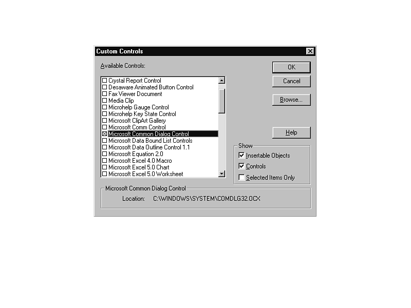
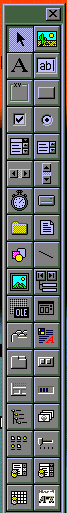
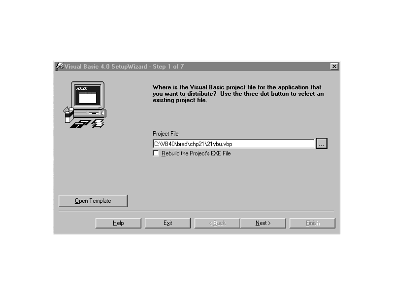
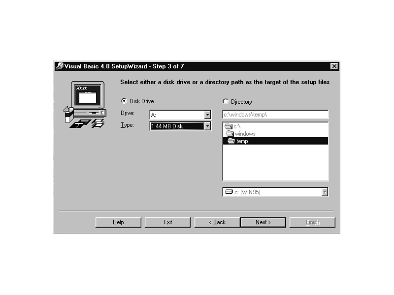
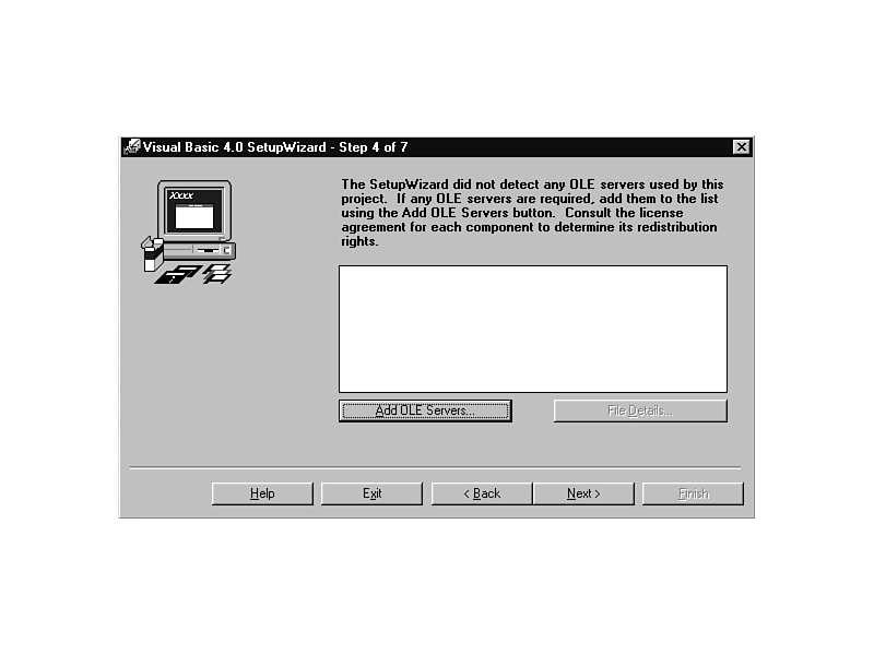
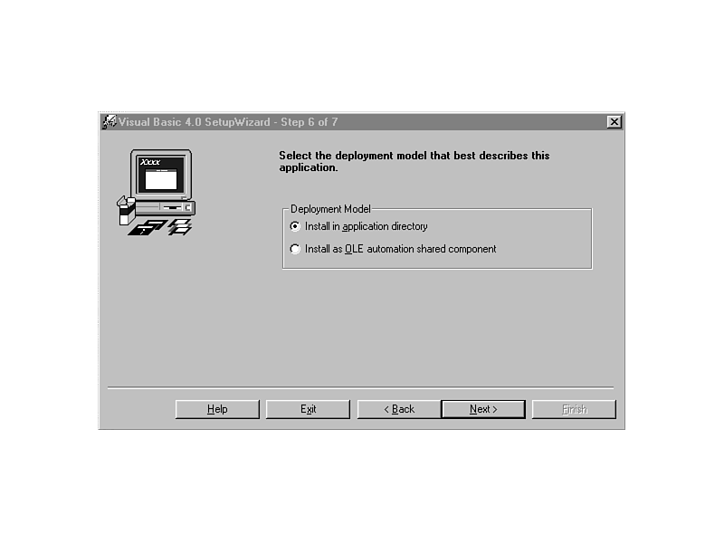
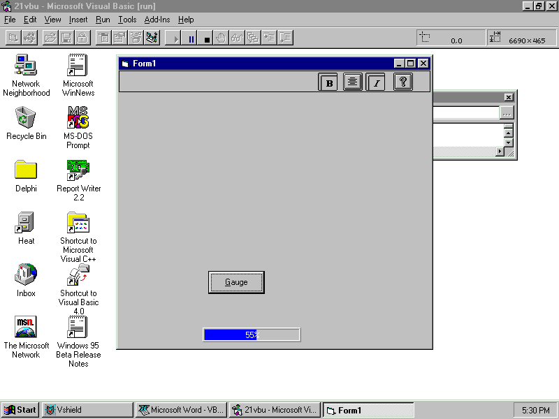
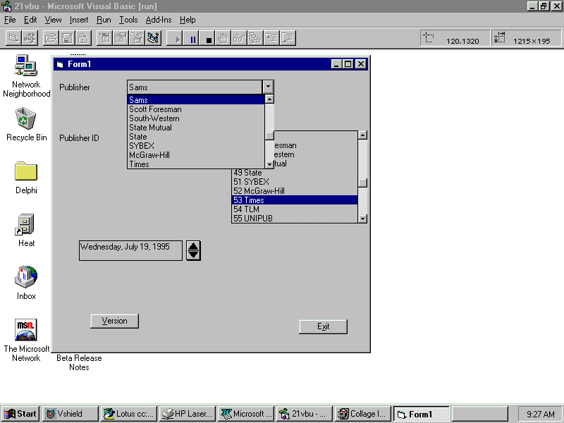
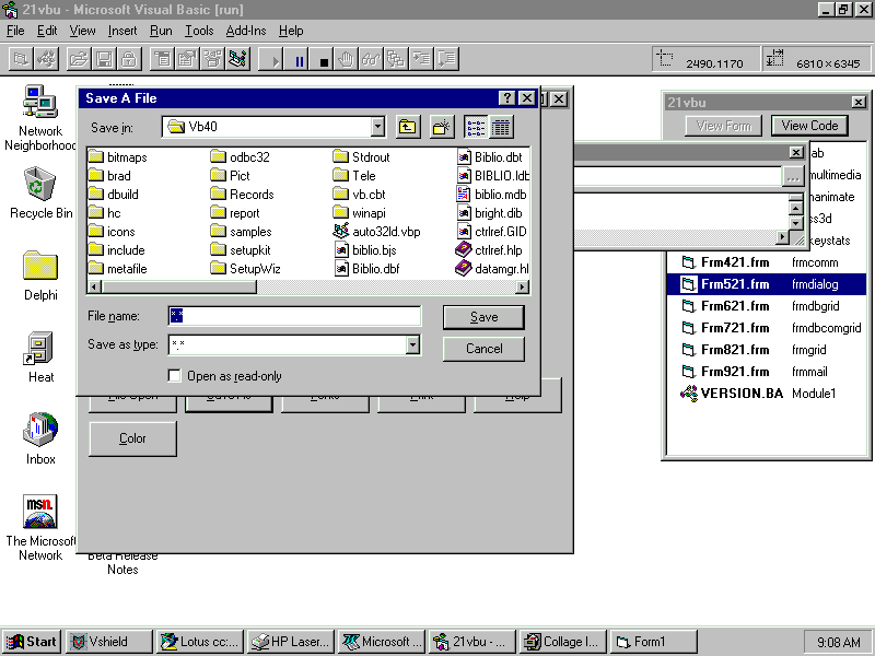
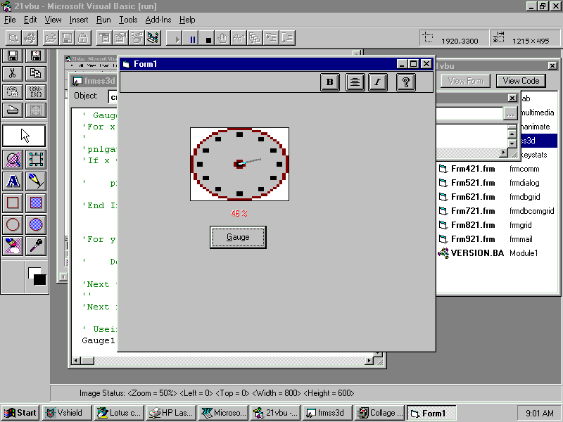
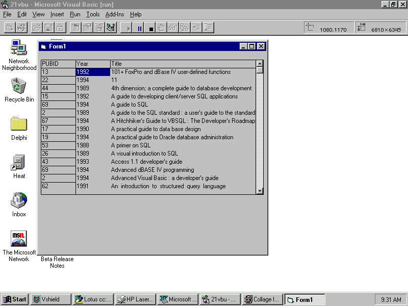
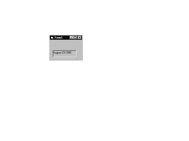
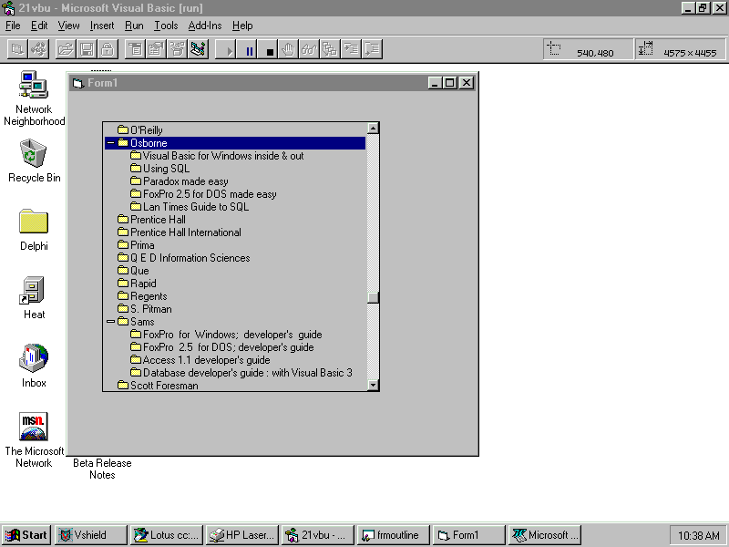
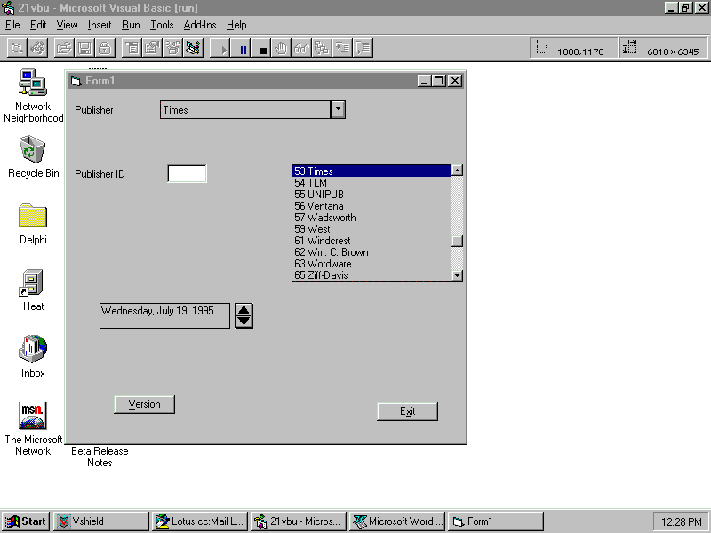
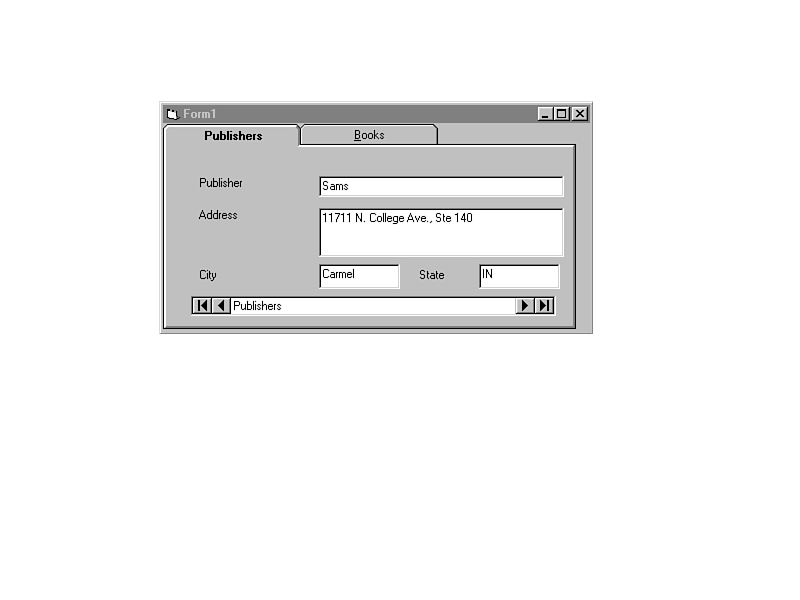